Bring your figures to life with data visualisation…
Discover Inside Dataviz!
Inside Dataviz: Why adopt it?
Data visualisation is the term used to talk about the recurring action of collecting, creating and analysing your encrypted data regardless of the department in which you work.
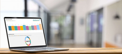
Our new module integrates your raw data, from an Excel file deposited in OneDrive and transforms them into playful and colorful visuals, easy to understand, which highlight the trends related to your activity: graphs, diagrams, maps, etc. choose the variables and the representation you want. Thus, your indicators are better identified and their analysis simplified.
Inside Dataviz can be associated with our decision-making reporting solution in Excel. Inside Reporting, or operate independently. Fun, simple and collaborative, Dataviz is THE full web data visualisation solution of the moment!
Inside Dataviz: How does it work?
The table sometimes lacks flexibility and readability to highlight certain values. The analysis is then more complex.
In addition, the software to analyse your figures are numerous but rarely practical.
Data visualisation saves time by compiling your data and helping you better interpret it. Our new module will, in complete autonomy, look for the necessary information to bring it back to the same place and thus create a modern and graphic dashboard.
Instantly, your data is collected and analysed in color to be better identified. You can easily compare them and identify trends to act better. The interpretation you give to your teams is also simpler and more accessible. You improve your transparency and internal communication.
Inside Dataviz: If I’m sedentary, how do I use it?
Inside Dataviz is the ideal solution to analyse your data and stay connected wherever you are. But as a sedentary person, from your workstation, this new module will also simplify your daily life…
Understand your data: The charts and visuals you create are easy to understand and save you valuable time analysing them.
React quickly: Clear, precise and weak, your indicators highlight trends. Thus, you calmly adopt a new strategy or you comfort yourself in your decision-making.
Share your analyses: Easy to understand, the information obtained is shared in real time and allows you to simply exchange with your collaborators who have instant access to the latest updates.

Make the right decisions
In the office or on the go,
Inside Dataviz analyses your data
and creates visuals to help you
to define your strategy.

Federate around your ideas
You present your figures
in the form of playful visuals,
easy to understand for you
to help explain your choices.

Save valuable time
You give real-time access
to the latest version of your
graphics so that your teams
access the right information.

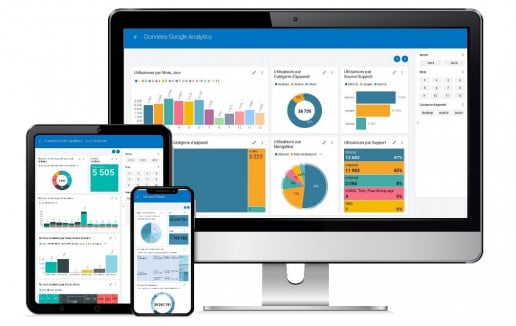
Stay connected from anywhere
When traveling or remotely,
your employees have access to all
your data quickly and from
any medium.
Inside Dataviz is a 100% Cloud module that brings your figures to life…
But what is it really?
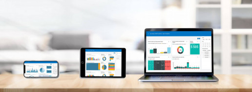
Wherever you are, remotely, in the office or on the go, on a computer, tablet or smartphone, it is important to access your data and create easy-to-interpret graphs to enlighten you in the implementation of your strategy.
Inside Dataviz, published by INFINEO, allows you to better understand your activity through colorful visuals highlighting your results, indicators and KPIs.
You start with a simple Excel file that you put in to Onedrive and you use your imagination by presenting relevant information.
Also think collectively and share your visualisations… Select who you give consultation access to and let your collaborators benefit from real-time updates. Thus, you have the same level of information and analyse the same trends to guide your choices.